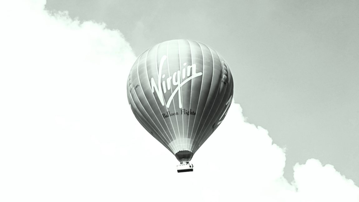
Yes, it was our RULER speaker Michael Johnson and his team that rebranded Virgin Atlantic, a true pioneer of the skies.
Why did they need a rebrand, you might ask? Well, because even though the company was top of mind, its words and visuals lagged behind. The perception of its brand was higher than its presentation.
The rebranding process is complex, we all know that. But have you ever wondered what it would be like, as an agency, to have to consider how your ideas and work will affect a plane’s fuel consumption? Well, Johnson Banks faced this challenge. The team had this environmental aspect in mind as they prepared the revamped Virgin Atlantic brand for many applications: they adapted core elements and lighter uniforms, and then moved on to other (equally as critical) aspects of the project.
The requirements of a modern airline brand identity are myriad and cover all shapes and sizes, from full colour fuselage, to screen-printed catering packs, to tiny logos on travel ‘aggregator' sites.-Michael Johnson
“For many applications within airports and advertising, a ‘landscape’ logo (i.e., long, wide and thin) is of paramount importance. But we also knew that if we could carefully craft the typography to allow a two-line (or stacked) version of the logo, this would also be very useful. In fact, the requirements of a modern airline brand identity are myriad and cover all shapes and sizes, from full colour fuselage, to screen-printed catering packs, to tiny logos on travel ‘aggregator’ sites.”
Another aspect of Johnson’s approach worth mentioning is collaboration with the brand communication team or agency to ensure that the brand looks and feels coherent in all instances. For this, Johnson Banks collaborated with RKCR/Y&R London.
Read (and see) more from this amazing project here.